Android TV will be Google's vanguard tool into the living room, especially the latest version of the interface was a new design, using Google's newly developed interface design language - Material Design. At the same time, it also combines the “card†design trends developed by mobile platforms. Google also really wants to create a set-top box TV market with new thinking.
In addition, Google has also repositioned its product features and encouraged developers to "develop extremely simple TV applications for extremely simple set-top box interfaces."
As the pioneer of Android TV design in China, the sofa butler recently released a V5 version that meets the design style of Android TV. It is also the first domestic TV application that meets the Android TV design philosophy.
Xiao Bian experienced the V4 and V5 versions of the sofa butler. From the perspective of the UI interface design, the sofa butler will understand Android TV design rules and combine their understanding of their own products, resulting in a trend that is not only leading the way. Practical and easy to use products.
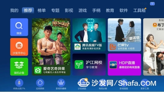
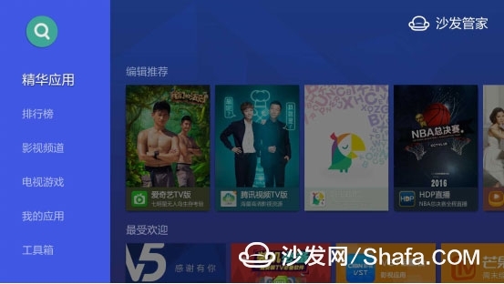
Android TV's design language is currently the most popular design style in the Android ring - Material Design.
Designed to design global advanced design specifications for the visual, motion, and interactive effects of multiple platforms and devices.
Let's follow Xiaobian to experience the charm of Android TV design language from the following three aspects together!
1, Android TV main screen layout design more humane
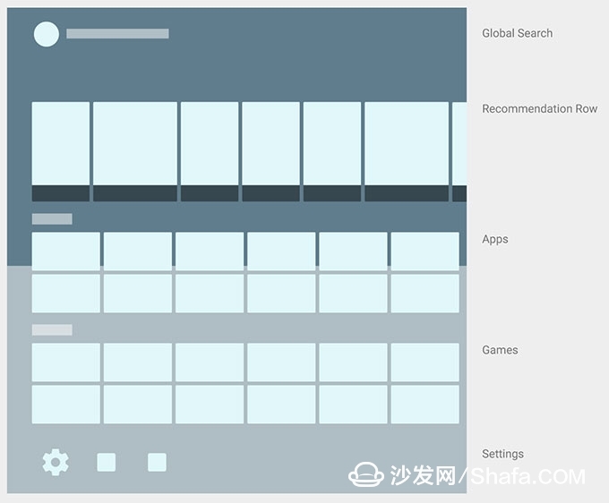
The Android TV user experience starts from the home screen and includes search, content recommendation, app list, and setting entry. The home screen provides a multi-level, cinematic-style and video content overview.
Material Design is used as the main interactive means by simulating the possibilities of paper stretching, deformation, and collage in the physical world. This method, combined with the characteristics of large-screen TVs, requires us to use card-sized graphics as an information carrier. Reducing the level of jumps, highlighting the content presentation as the most important purpose of the page layout, making the overall interaction process more concise and light.
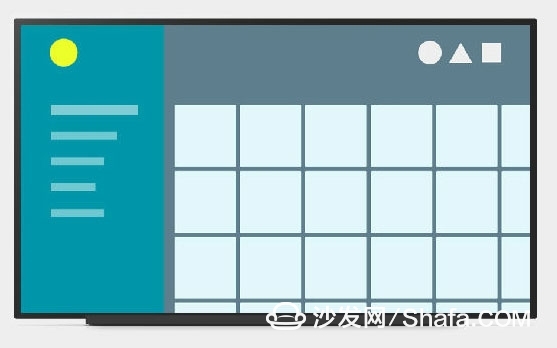
The sofa butler not only provides application management functions such as application downloading, updating, and TV optimization, but also highlights the TV's large screen advantage and visually matches the TV's widescreen and strives to achieve a "lighter and faster" experience.
The layout of the content on the right side of the left menu is adopted. The horizontal layout is used for the recommendation position and the list page. The card design is adopted for the icons. The "shaft shadow" focus design scheme is introduced, and the key operation between the main screen and the appreciation content is not It will be more than three times.
The recommended bar at the top of the home screen is the core element. This column is for users to personalize content, continue playing the content on the device or other devices, and also help users discover new content they may like.
2, using the most advanced mobile APP design trends: card design
Card layout advantages: Simple layout, clear hierarchy, fast loading. Not only does it give good visual consistency, but it also makes it easier to design iterations. More importantly, content units of different sizes and different media can be mixed and presented in a unified manner. It is necessary to achieve as much visual consistency as possible, but also to balance the strength of text and pictures. At this time, card designs often have miraculous effects.
Second, the cards are three-dimensional, have depth that can be flipped, and are very extensible. As shown below:
The following is the V5 version UI of the sofa butler:
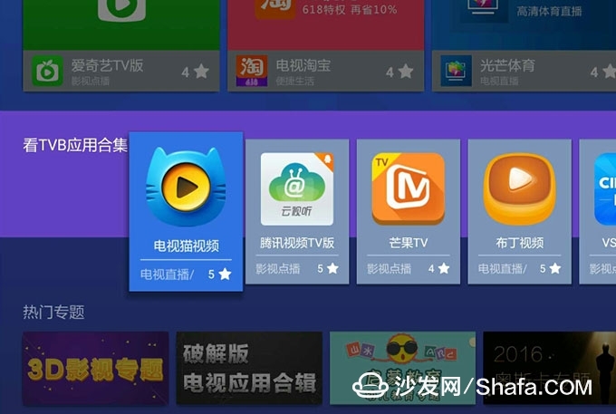
The right side of the sofa butler adopts a card-type layout with a clear and easy-to-adaptive layout, and also increases the projection effect! It also highlights the three-dimensionality of each card!
On the left is a scalable navigation menu that is very simple! On the right is the content area that the user is interested in! Scroll up and down. Create a left-to-right, top-to-bottom navigation mode! The mobile experience is perfect!
Use a horizontal layout and provide visual transitions between pages. If you want to use vertical scrolling, limit its range to the detail area in the page. Keep the left navigation bar fixed. In addition, keeping the context easy to understand will make it easier for the user to understand.
3, the interface is intuitive and easy to understand
Today's interactions are not simply human-machine interface interactions, but also interaction technologies such as voice, gestures, and face recognition. These interaction methods and technologies are also gradually applied in products.
For example, after Material Design introduced the new "Z-axis" concept, the "Z-axis" was emphasized to highlight the spatial relationship between pages. Every time you move and click, the pages spread out from the center of the mobile. The entire interface is very easy to understand and operate.
Second, the keyword is "Overlay" and go to homepage. Removing the design of the homepage alleviates the user's burden of making selections and makes watching TV "more like" watching television programs.
More importantly, on AndroidTV, search still exists, and the input mode is changed to voice, which really optimizes the product experience and partially solves the problem of input on TV. At present, some boxes in the Chinese market are operated with voice remote controls. Interested partners can try it out!
The interaction design of the sofa butler balances the "high standards" of AndroidTV and the actual user experience of Chinese users. The details worth recommending are:
First: smooth screen transitions. There are special effects for caching scrolling up and down. If the speed is slow, a rotating loaded animation will appear in the center of the screen. Tell the user to wait a little bit.
Second: It is the user who selects a card and puts it into special effects. Very eye-catching, one can catch the user's eye. At the same time the icon will have some small animation effects. That is, it matches the UI controls of Android TV that each cursor can access (such as links or buttons) and leaves enough space around the controls. Form a visual focus. As shown below:
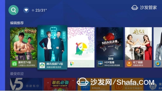
Third, add instructions or highlighting for selectable, navigable items in the interface. This is a very good design. This inspires the user to better operate the V5 ui interface design.
Fourth, the direction key controller limits the movement to upper, lower, left, and right. Use the Enter or OK key in the middle of the arrow keys to trigger the cursor. The user can quickly and easily interact with the V5 interface by simply controlling the navigation keys.
In general, the V5 version of the sofa housekeeper, from the user experience interface design point of view, almost meets the following four points:
1, to maintain the consistency of the design.
2, to maintain the consistency of the behavior of the elements.
3. Keep all important operations and options visible, including search, settings, returns, and more. In a ten-foot environment, invisible elements are easily remembered, even if they are off screen or on a remote control.
4. Use only one visual navigation mode or one information level. This guides the user to adapt to all UI mental models.
In the end, Xiao Bian felt that it was possible to turn product design ideas into a trend, and that the design of the UI interface was easy to use, good-looking, matched with product usage scenarios, and bold innovations were enough to let us understand that a sofa butler is a willing person. With a focus on UI design, TV applications that emphasize user interaction experience.
Furthermore, Google’s officially released Android TV design specifications are not perfect. They are also trying their best to meet user preferences, and even guiding users to find their own needs, and constantly improve the Android TV design specifications.
Of course, we are also willing to follow Android TV as a pioneer who focuses on innovative design and make progress together.
In addition, Google has also repositioned its product features and encouraged developers to "develop extremely simple TV applications for extremely simple set-top box interfaces."
As the pioneer of Android TV design in China, the sofa butler recently released a V5 version that meets the design style of Android TV. It is also the first domestic TV application that meets the Android TV design philosophy.
Xiao Bian experienced the V4 and V5 versions of the sofa butler. From the perspective of the UI interface design, the sofa butler will understand Android TV design rules and combine their understanding of their own products, resulting in a trend that is not only leading the way. Practical and easy to use products.

Sofa butler Android TV v4.8.3

Sofa butler latest Android TV design version v5
Android TV's design language is currently the most popular design style in the Android ring - Material Design.
Designed to design global advanced design specifications for the visual, motion, and interactive effects of multiple platforms and devices.
Let's follow Xiaobian to experience the charm of Android TV design language from the following three aspects together!
1, Android TV main screen layout design more humane
The Android TV user experience starts from the home screen and includes search, content recommendation, app list, and setting entry. The home screen provides a multi-level, cinematic-style and video content overview.
Material Design is used as the main interactive means by simulating the possibilities of paper stretching, deformation, and collage in the physical world. This method, combined with the characteristics of large-screen TVs, requires us to use card-sized graphics as an information carrier. Reducing the level of jumps, highlighting the content presentation as the most important purpose of the page layout, making the overall interaction process more concise and light.

The sofa butler not only provides application management functions such as application downloading, updating, and TV optimization, but also highlights the TV's large screen advantage and visually matches the TV's widescreen and strives to achieve a "lighter and faster" experience.
The layout of the content on the right side of the left menu is adopted. The horizontal layout is used for the recommendation position and the list page. The card design is adopted for the icons. The "shaft shadow" focus design scheme is introduced, and the key operation between the main screen and the appreciation content is not It will be more than three times.
The recommended bar at the top of the home screen is the core element. This column is for users to personalize content, continue playing the content on the device or other devices, and also help users discover new content they may like.
2, using the most advanced mobile APP design trends: card design
Card layout advantages: Simple layout, clear hierarchy, fast loading. Not only does it give good visual consistency, but it also makes it easier to design iterations. More importantly, content units of different sizes and different media can be mixed and presented in a unified manner. It is necessary to achieve as much visual consistency as possible, but also to balance the strength of text and pictures. At this time, card designs often have miraculous effects.
Second, the cards are three-dimensional, have depth that can be flipped, and are very extensible. As shown below:

The following is the V5 version UI of the sofa butler:

The right side of the sofa butler adopts a card-type layout with a clear and easy-to-adaptive layout, and also increases the projection effect! It also highlights the three-dimensionality of each card!
On the left is a scalable navigation menu that is very simple! On the right is the content area that the user is interested in! Scroll up and down. Create a left-to-right, top-to-bottom navigation mode! The mobile experience is perfect!
Use a horizontal layout and provide visual transitions between pages. If you want to use vertical scrolling, limit its range to the detail area in the page. Keep the left navigation bar fixed. In addition, keeping the context easy to understand will make it easier for the user to understand.
3, the interface is intuitive and easy to understand
Today's interactions are not simply human-machine interface interactions, but also interaction technologies such as voice, gestures, and face recognition. These interaction methods and technologies are also gradually applied in products.
For example, after Material Design introduced the new "Z-axis" concept, the "Z-axis" was emphasized to highlight the spatial relationship between pages. Every time you move and click, the pages spread out from the center of the mobile. The entire interface is very easy to understand and operate.
Second, the keyword is "Overlay" and go to homepage. Removing the design of the homepage alleviates the user's burden of making selections and makes watching TV "more like" watching television programs.
More importantly, on AndroidTV, search still exists, and the input mode is changed to voice, which really optimizes the product experience and partially solves the problem of input on TV. At present, some boxes in the Chinese market are operated with voice remote controls. Interested partners can try it out!
The interaction design of the sofa butler balances the "high standards" of AndroidTV and the actual user experience of Chinese users. The details worth recommending are:
First: smooth screen transitions. There are special effects for caching scrolling up and down. If the speed is slow, a rotating loaded animation will appear in the center of the screen. Tell the user to wait a little bit.
Second: It is the user who selects a card and puts it into special effects. Very eye-catching, one can catch the user's eye. At the same time the icon will have some small animation effects. That is, it matches the UI controls of Android TV that each cursor can access (such as links or buttons) and leaves enough space around the controls. Form a visual focus. As shown below:

Third, add instructions or highlighting for selectable, navigable items in the interface. This is a very good design. This inspires the user to better operate the V5 ui interface design.
Fourth, the direction key controller limits the movement to upper, lower, left, and right. Use the Enter or OK key in the middle of the arrow keys to trigger the cursor. The user can quickly and easily interact with the V5 interface by simply controlling the navigation keys.
In general, the V5 version of the sofa housekeeper, from the user experience interface design point of view, almost meets the following four points:
1, to maintain the consistency of the design.
2, to maintain the consistency of the behavior of the elements.
3. Keep all important operations and options visible, including search, settings, returns, and more. In a ten-foot environment, invisible elements are easily remembered, even if they are off screen or on a remote control.
4. Use only one visual navigation mode or one information level. This guides the user to adapt to all UI mental models.
In the end, Xiao Bian felt that it was possible to turn product design ideas into a trend, and that the design of the UI interface was easy to use, good-looking, matched with product usage scenarios, and bold innovations were enough to let us understand that a sofa butler is a willing person. With a focus on UI design, TV applications that emphasize user interaction experience.
Furthermore, Google’s officially released Android TV design specifications are not perfect. They are also trying their best to meet user preferences, and even guiding users to find their own needs, and constantly improve the Android TV design specifications.
Of course, we are also willing to follow Android TV as a pioneer who focuses on innovative design and make progress together.
Rotating Air Fryer,Best Rotating Air Fryer,Air Fryer With Rotating Basket,Best Multifunction Air Fryer
Ningbo ATAP Electric Appliance Co.,Ltd , https://www.atap-airfryer.com